jueves, 30 de septiembre de 2010

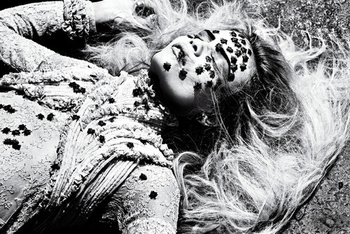
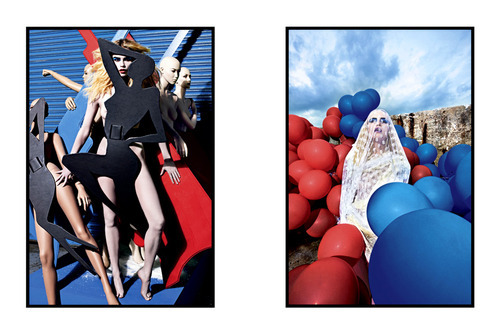
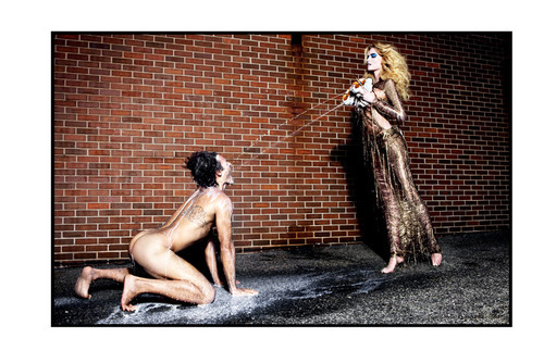
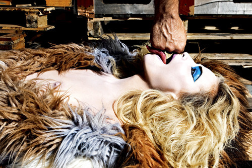
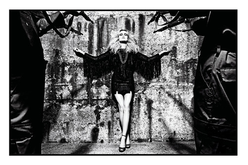
Eniko goes insanely colorful, Vogue Paris October 2010


Images via Fashionising

Eniko Mihalik goes colorful and insane for October issue of Vogue Paris. Photography by Terry Richardson.

Gareth Pugh fashion film SS11


Gareth Pugh SS11, by Ruth Hogben & Showstudio

PFW: Gareth Pugh SS11


Images via Style.com
Yesterday I was expecting a runway show for Gareth Pugh. So you can figure how shocked (and delighted) I was when he presented his collection in a fashion film, in collaboration with director Ruth Hogben and ShowStudio. If you’ve read this blog before you know I’m a big sucker for fashion films. But, how good was that Mr. Pugh showed his collection in this way? There are many pros and cons of using new media to replace the catwalk (if you want to read more about this go here to read Suzy Menkes article in the NYTimes). Truth is, fashion film is a creative and fresh way to show a designer’s work in a closer reality to what they want to express with the garments, than what sometimes it’s interpreted by critics. The influence of the collection can be merged in this audiovisual aid and have a greater emotional impact in people. In the other side, fashion shows are a mayor part of the fashion industry, only from the business point of view it’s too much money to just stop doing it. 
What Gareth Pugh wanted to achieve with this film was to fully express the essence of his collection, going from futuristic to surreal with Kristen McMenamy representing a goddess of abstraction. About the collection, it was clean, minimalistic and futuristic all at the same time; the drama factor was lead by  the volume and fabrics used. I have to admit I’m not a big fan of futuristic silhouettes, but this time I completely enjoyed the way the collection was presented, so much, I can see myself in each and every one of the pieces. 

PFW: Dries Van Noten SS11


Images via Style.com
Paris finally! The most important fashion week has started and the first show I saw was Dries Van Noten. The combination between boyish garments along with the floral prints, influenced by Chinese culture, made me think of this collection as ombré breezy (weird name), but the thing is Van Noten tried to combine the proportions of each piece with the textures of the fabrics, having an amazing result. Not only the colors were sweet and calm but the mixture of fabrics gave the collection an essence oflight. Over sized (moderate) pieces were the statement for Van Noten, which went from the boyfriend jacket to the wide leg cotton pants. The floral prints in dresses and sheer fabrics were influenced by Chinese ceramic, and there are some looks we can even find resembling a kimono. The iridescent clutches were the dynamic detail, along with the fades in jackets and dresses. This is such a beautiful collection, and I’m sure we can expect much more from this week. 

miércoles, 29 de septiembre de 2010

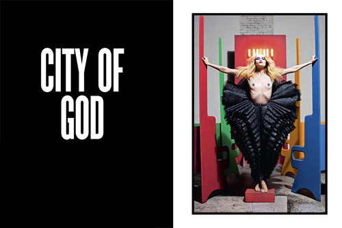
City of God, Natasha Poly for V Magazine


Images via V Magazine
Sometimes we forget photography is meant to create an impact. Either sociological, political o aesthetically speaking, photography is created with a specific message to distribute; fashion photography is not the exception. I am a big fan of editorials that go beyond the typical themes for aesthetic purposes and actually present something new. We’ve seen quite a few times the religion theme, for example, Miranda Kerr for Número or Courtney Love for LaChapelle. But every time I see a new editorial with this theme I’m thrilled to see how they are going present it with a new perspective. That’s why I was delighted with this editorial featuring Natasha Poly, posing for the lens of Mario Sorrenti for V Magazine. Irreverent, surreal and sexual, the editorial has clear influences of LaChapelle (the poses) and Buñuel (Un chine andalou) with his photograph of Natasha invaded by tiny spiders (kudos for Mrs. Poly, she looks incredibly glam even when she is in a fear factor situation) and the mixture of B/N and blue-red palette is great. The styling by Jane How, and the make up by Aaron de Mey, are sublime, and seeing an editorial that goes for the risky themes without being aggressive is always a pleasure.

MFW: Giorgio Armani SS11


Images via Fashonologie

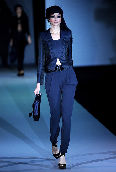
Between black and midnight blue, Giorgio Armani presented a collection which could have been inspired by Arabian Nights. The influence of a heated dessert along with the beauty of the night was in all the collection, being represented by head wraps, sequined long dresses, and tons of layers, a trait characteristic of the Arabian culture. Again, Armani refuses to please the crowd and give something special, stand out and reaffirm why he is considered a standard for elegance.
lunes, 27 de septiembre de 2010

Bal Masqué, Vogue Paris


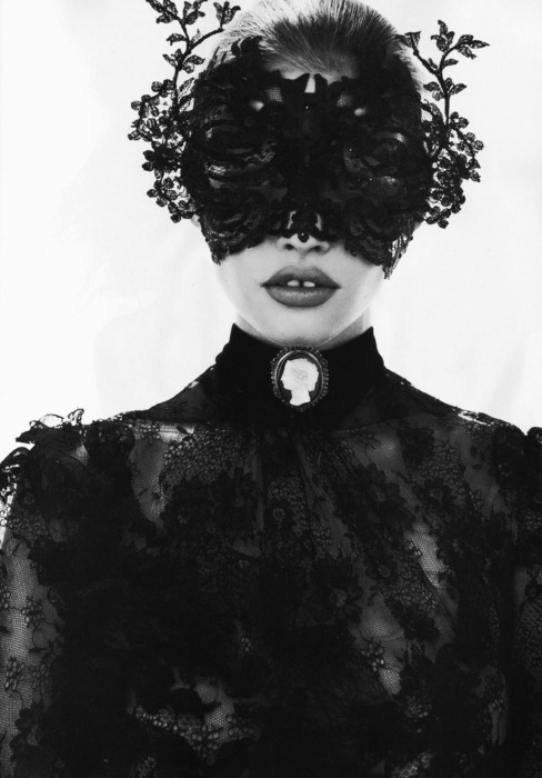
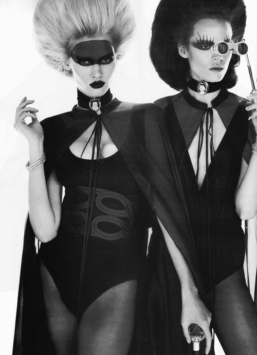
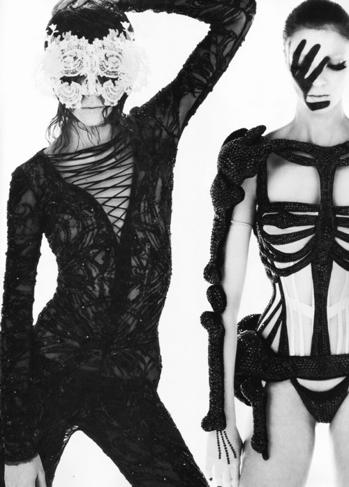
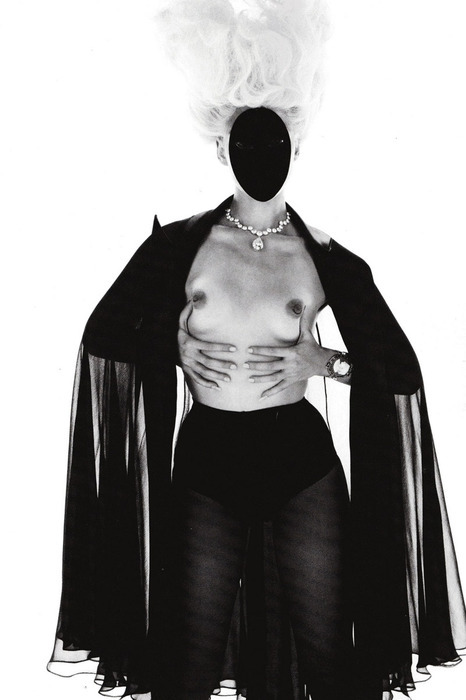
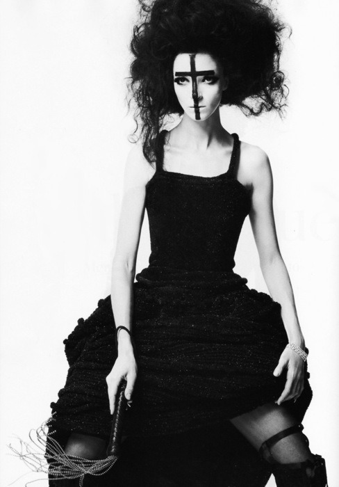
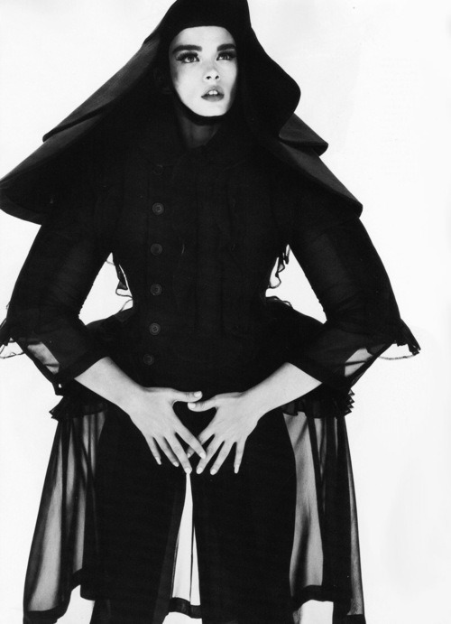
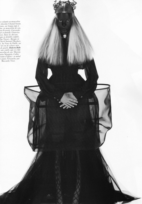
You can’t tell how excited I am for October. I love it, not only because of the costume parties but there’s such a dark vibe the whole month I can’t describe it; I’m terribly thrilled. And just when I thought it couldn’t get any better I ran into the whole editorial for the October issue of Vogue Paris. Photographed by Mert & Marcus, and styled by Carine Roitfeld herself, the shoot features Lara Stone, the lovely Freja Beha, Crystal Renn, MariaCarla Boscono and Daphne Groevneveld in this masquerade party where each of them plays a character that could be inspired by the Grimm brothers. The mood of the shoot couldn’t be more somber, thanks to the high contrast of the pictures, and the styling couldn’t be more awesome (i’m seriously considering one of this outfits for my Halloween costume). Givenchy, Altuzarra and Philip Treacy are some of the brands that appear in this incredible editorial, making it even better. I’m not sure how but I’m determined to get French Vogue next month. October here we go!
Images via Fashion Gone Rogue

MFW: Emilio Pucci SS11


Images via Style.com